LANTERN is:

CASUAL, IN-THE-KNOW, PERSONABLE
As an in-house visual designer at Lantern, a consumer focused technology platform operating in the cannabis delivery space, I harnessed the brand’s visual ecosystem to weave 360 degree story telling.
Email campaigns, logo animations, print media, social media, and so much more came together to tell the larger tale of Lantern, allowing us to lead the market with owning over 50% of all state-level orders.
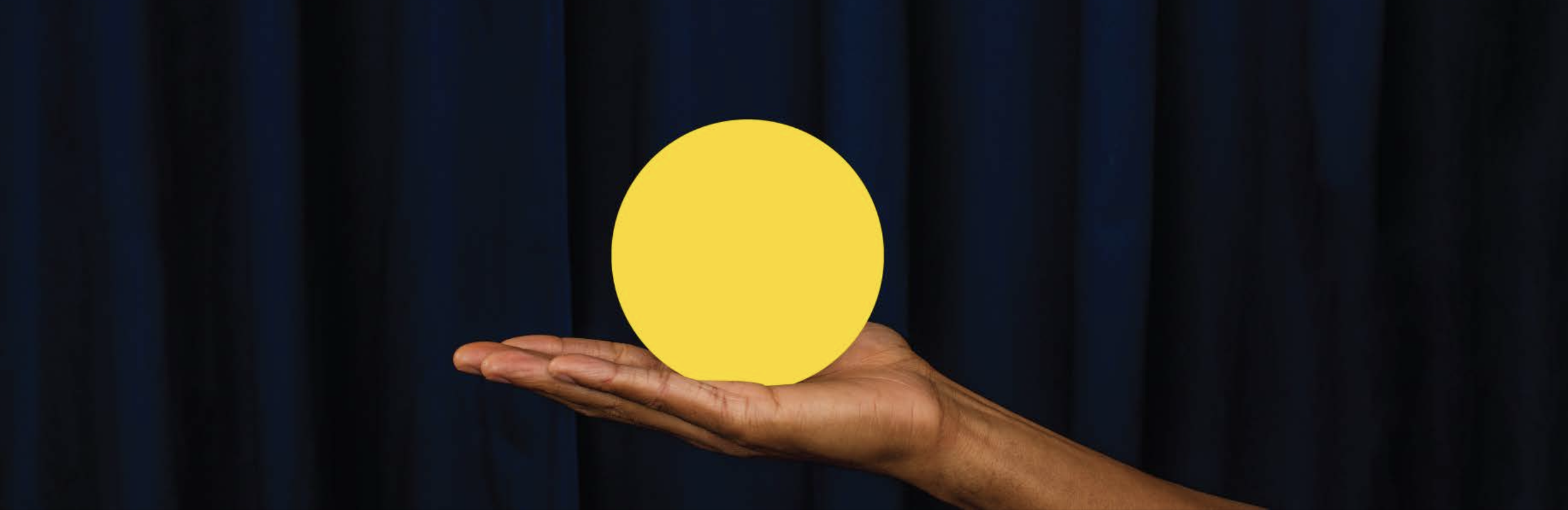
Playful, bold shapes - like circles, squares, and triangles - interplay with fluid, organic forms to create a vibrant, welcoming, and energetic brand aesthetic.
EMAILS
EMAILS
Email campaigns were designed and sent out to tens of thousands of subscribers. Through these, not only were sales generated, but the visual identity was reinforced to consumers seeking genuine brand connections.
marketing
marketing
As a cannabis delivery technology, Lantern was responsible for over half of all deliveries made in the entire state of Massachusetts.
We wanted our social media to look and feel just like our brand: approachable, knowledgable, and fun.


out of home
out of home
Live events and community integration were a cornerstone of the Lantern brand. Out of home invites for hosted events were used to portray the identity, build excitement, and impart important RSVP details, all while maintaining visual appeal.
MOTION DESIGN
MOTION DESIGN
Lantern logo animation #1
Lantern logo animation #2